
PowerPoint Charts & Data Visualization for Business
Learn everything about Charts in PowerPoint. Learn how to choose the right chart type for your Data Visualization.
Lo que serás capaz de hacer
The course explained in one sentence: A practical approach to teaching all charting features of PowerPoint enhanced with practical data visualization tips and guidelines. Why charts in PowerPoint? Demystifying Charts - Let me teach you, once and for all, how to correctly approach and use charts in PowerPoint PowerPoint Features - The reason so many charts look exactly alike is that not many people are diving deep into their options - but once you learn, just once, where everything is it repeats itself for most chart types. Correct data showcase - Know how to select your chart and what are the advantages of every chart. The line chart is optimal for time-based data that has many data points (above 10 for example), and the pie chart is perfect to showcase "parts of a whole", like percentages out of 100%. What will I learn? How to use charts in PowerPoint and all its features What chart type to use in what situation It is completely project-based and practical PowerPoint usage at an intermediate level Demistyfies the PowerPoint chart feature and makes you an expert in it. Who is this course for? Everyone who wants to learn about charts, once and for all Data visualization is an ever-green, lifelong skill to acquire, so I would say it's for everyone. After this course, you will look differently at all the charts you see because I will give you practical advice about every chart type we work on The course is suitable for PowerPoint for Windows and PowerPoint for MAC users, as all resources have been tested and confirmed to work Resources: As always, I keep my courses practical and based on real-world experience. This is important especially with charts and data visualization in PowerPoint, since you need to be able to analyze your data set and select the correct chart for it. Each single chart type has several projects to follow along. Each project contains: - A dedicated data set as an example - A ready example of the chart so you can preview it - A custom slide with explanations to work step-by-step Have PowerPoint charts changed over the years? No! This is an ever-green feature PowerPoint chart features are almost identical in all its versions. PowerPoint 2016, PowerPoint 2019, PowerPoint 2019 and now Microsoft365 with its subscription offer a variety of charts for our data visualizations. Let us learn all the features that we have available to make better Microsoft PowerPoint presentations. I hope you are interested in this amazing topic. Get ready to elevate your presentations with captivating charts and compelling data visualization techniques. Enroll now and I'll see you inside!
- Most used chart types - Line, Bar, Column, Area and more
- How to choose the right chart type
- Effective use of PowerPoint's charting features
- Animating charts & data
- Understanding the principles of data visualization
- Best practices for labeling and writing titles
Temario
UNIDAD 1 - Introduction · 2 leccionesUNIDAD 1 - Introduction
UNIDAD 1 - Introduction
- Introduction
- Download Resources
UNIDAD 2 - PowerPoint Charts - Understanding the Tool · 6 leccionesUNIDAD 2 - PowerPoint Charts - Understanding the Tool
UNIDAD 2 - PowerPoint Charts - Understanding the Tool
- Introduction to different charts
- PowerPoint Charts #1 - Chart Basics (Part 1)
- PowerPoint Charts #1 - Chart Basics (Part 2)
- PowerPoint Charts #2 - Arcane Knowledge
- PowerPoint Charts #3 - Color Scheme
- PowerPoint Charts #4 – Design Elements of a Chart
UNIDAD 3 - Data Visualization - Line Charts · 7 leccionesUNIDAD 3 - Data Visualization - Line Charts
UNIDAD 3 - Data Visualization - Line Charts
- Line Chart - When to use
- Line Chart #1 (Part 1) - Chart and its title
- Line Chart #1 (Part 2) - Formatting and Labelling
- Line Chart #2 - Visual Declutter - PowerPoint Presentation tip
- What is an Action Title
- Line Chart #3 - Highlighting Data
- Quick Quiz about the Line Chart!
UNIDAD 4 - Data Visualization - Column / Bar Charts · 6 leccionesUNIDAD 4 - Data Visualization - Column / Bar Charts
UNIDAD 4 - Data Visualization - Column / Bar Charts
- Column and Bar Chart - Explanation
- Column and Bar #1 - Column Chart
- Column and Bar #2 - Bar Chart
- Stacked Column Chart - Explanation
- Column and Bar #3 - Stacked Bar Chart
- Column and Bar Chart Practice test
UNIDAD 5 - Data Visualization - Pie Charts · 4 leccionesUNIDAD 5 - Data Visualization - Pie Charts
UNIDAD 5 - Data Visualization - Pie Charts
- Pie Chart – When to Use
- Pie Chart #1 - Formatting it in a PowerPoint presentation
- Pie Chart #2 – Rotating for correct display
- Pie Chart #3 – Doughnut Chart
UNIDAD 6 - Data Visualization - Area Charts · 6 leccionesUNIDAD 6 - Data Visualization - Area Charts
UNIDAD 6 - Data Visualization - Area Charts
- Area Chart – When to Use
- Area Chart #1 – Reorganize Series
- Area Chart #2 - Grouping Categories, advanced PowerPoint charts
- Area Chart #3 – Projective Data and PowerPoint for MAC
- Area Chart #4 – Stacked Area Chart in Microsoft PowerPoint
- Showcase one of your grahps!
UNIDAD 7 - Data Visualization - Waterfall Charts · 3 leccionesUNIDAD 7 - Data Visualization - Waterfall Charts
UNIDAD 7 - Data Visualization - Waterfall Charts
- Waterfall Chart – Introduction
- Waterfall Chart #1 – With Two Totals
- Waterfall Chart #2 – With One Total
UNIDAD 8 - Data Visualization - Pictographs · 3 leccionesUNIDAD 8 - Data Visualization - Pictographs
UNIDAD 8 - Data Visualization - Pictographs
- Pictograph – Explanation
- Pictograph #1 – Icons as measurement
- Pictograph #2 – Icon Infographic in Microsoft PowerPoint
UNIDAD 9 - Data Visualization - Maps · 3 leccionesUNIDAD 9 - Data Visualization - Maps
UNIDAD 9 - Data Visualization - Maps
- Map Exercise #1 – World or Country
- Map Exercise #2 – Native PowerPoint Map
- Map Exercise #3 – PowerPoint Templates
UNIDAD 10 - Data Visualization - Combo Chart · 1 leccionesUNIDAD 10 - Data Visualization - Combo Chart
UNIDAD 10 - Data Visualization - Combo Chart
- Combo Chart #1 - Line and Column for MS PowerPoint
UNIDAD 11 - Animating Charts and Data · 5 leccionesUNIDAD 11 - Animating Charts and Data
UNIDAD 11 - Animating Charts and Data
- PowerPoint Animation Practice #1 – Basics about Chart Animation
- PowerPoint Animation Practice #2 - Separating Series - Advanced PowerPoint
- PowerPoint Animation Practice #3 – Animate by Series, by Category
- PowerPoint Animation Practice #4 – Using Transitions to Visualize Data
- PowerPoint Animation Practice #5 – Using PowerPoint Morph
UNIDAD 12 - Good Practices & Useful PowerPoint Knowledge · 6 leccionesUNIDAD 12 - Good Practices & Useful PowerPoint Knowledge
UNIDAD 12 - Good Practices & Useful PowerPoint Knowledge
- Good Practices #1 - Colors and Editing
- Good Practices #2 – Gradient Bars
- Good Practices #3 - Marker Design in ms PowerPoint
- Good Practices #4 - Trendline
- Adding a Chart Template Windows and MAC
- Setting as Default - PowerPoint for Windows, PowerPoint for MAC
UNIDAD 13 - Conclusion · 2 leccionesUNIDAD 13 - Conclusion
UNIDAD 13 - Conclusion
- Thank You!
- Bonus Lecture
Tu certificado lo emite la SEP, no solo una plataforma
Al demostrar la competencia recibes un certificado emitido por la Secretaría de Educación Pública a través del Gobierno del Estado de México: un documento oficial que puedes presentar con confianza ante cualquier empleador o institución.
Tu certificado con INEC
- Lo emite la Secretaría de Educación Pública (SEP), a través del Gobierno del Estado de México
- Documento oficial con folio verificable en línea
- Lo otorga la Universidad Tecnológica Fidel Velázquez
Otras plataformas en línea
- Constancia privada emitida por la misma plataforma
- Solo acredita horas cursadas o asistencia
- Sin respaldo de una autoridad educativa
Tu itinerario, de la inscripción al certificado
- 1
Inscripción con pago único
Pagas $2,800 MXN una sola vez y entras de inmediato al curso.
- 2
Estudias a tu ritmo
13 unidades con videos, lecturas y actividades, disponibles 24/7 durante 12 meses.
- 3
Cuestionarios por unidad
3 cuestionarios para comprobar lo aprendido.
- 4
Certificado
Emitido por la SEP a través del Gobierno del Estado de México, con folio verificable.
Un certificado oficial de la SEP
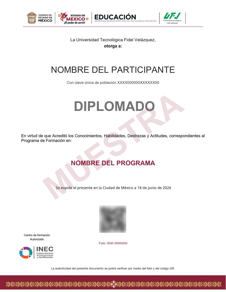
Muestra · verificable por folio y QR
- Emitido por la Secretaría de Educación Pública (SEP), a través del Gobierno del Estado de México. No es una constancia privada: es un documento oficial, y ese respaldo marca la diferencia frente a otras plataformas en línea.
- Contenido impartido por Andrew Pach.
- Folio y QR verificables para compartirlo con quien te contrate.
Empieza hoy, a tu ritmo
Un solo pago y acceso inmediato al curso completo durante 12 meses.
- 13 unidades · 54 lecciones · 60 h
- 12 meses de acceso
- 3 cuestionarios de evaluación
- Certificado emitido por la SEP (Gob. del Estado de México) con folio verificable
Sobre tu inscripción
¿Cómo es el pago?
Un solo pago de $2,800 MXN. No hay mensualidades ni cargos recurrentes.
¿Cuánto tiempo tengo acceso?
12 meses desde tu inscripción, 24/7, para avanzar a tu ritmo.
¿Quién imparte el contenido?
El curso es impartido por Andrew Pach; INEC gestiona tu inscripción, evaluación y certificado.
¿Qué pasa cuando vence mi acceso?
Puedes renovar tu cuenta tú mismo desde la plataforma, sin trámites ni esperas.

