
How To Design for Accessibility: for UX Designers (WCAG 2.2)
Accessibility and Usability Best Practices for UX and UI Designers (User Experience + WCAG 2.2, Section 508, ADA)
Lo que serás capaz de hacer
Do you want to easily design accessible interfaces for digital products? But maybe you’ve been overwhelmed by the amount of information out there about accessibility , or don’t know where to start for just the design side of things? As a seasoned User Experience (UX) designer, experienced with Accessibility, I'm here to solve these issues for you! (Also, if you need to learn about WCAG 2.1 / 2.2 or your country's legal requirements this course has you covered! E.g. the U.S.'s Section 508 and Americans with Disabilities Act (ADA), India's Guidelines for Indian Government Websites (GIGW) and Rights of Persons with Disabilities Act (RPwD Act), the European Union's Web Accessibility Directive (EN 301 549) Web Accessibility Directive (2016/2102) and European Accessibility Act (2019/882), the United Kingdom's Equality Act (2010), or any others that are based on/reference the Web Content Accessibility Guidelines) The Problem: One of the big problems UX and Product Designers have is that, if we want to design accessible digital products, we have to dig through a HUGE stack of accessibility guidelines, and they tell us things like: For accessibility compliance, “a mechanism is available to allow the purpose of each link to be identified from link text alone, except where the purpose of the link would be ambiguous to users in general.” Or “Color is not used as the only visual means of conveying information, indicating an action, prompting a response, or distinguishing a visual element.” Does that give you clarity on how to specifically design an accessible interface and still look aesthetic? Not so much! The Solution: The solution, taught in this course, is a set of 51 essential best practices for designing accessible interfaces. And they are just the aspects of accessibility that apply to a designer’s job, which as a designer you are responsible for and have control over; we won’t get into the code. This course is based on the latest WCAG 2.1 and 2.2 Guidelines, so you’re getting the freshest information. Whenever new guidelines are released this course is promptly updated. 10 things you will get out of this course: Whether you design digital products yourself, or you oversee their design, with these best practices added to your toolbelt: You will have a superior design process that enables you to design more accessible (and user-friendly) interfaces from the start. You will be able to identify accessibility violations just by looking at an interface design! You will stand out as an impressive, top-tier designer to your boss and clients (since few designers are well-versed in accessible design and accessibility for UX). You will be loved by your developers for sending them mockups they don’t have to make accessibility changes to. Your team will save time, and your client will save money, because there will be fewer changes needed at the end to meet accessibility compliance. Your team and the client will be more safeguarded from lawsuits if and when your team has made a fully accessible digital product (because some groups can be sued for discrimination if their digital products do not meet accessibility and WCAG compliance). You will receive an Accessibility certification. It certifies your completion of this training. Post your certification to your LinkedIn, list it on your resume or website, hang it next to your desk, and bask in your well-earned professional bragging rights! You will be able to speak about Design Accessibility with confidence. You will be prepared for any job that requires knowledge of designing for Accessibility. You will be able to add this to your CV (put it under Professional Development as Accessibility for UX Designers , Udemy, and the year of completion). This will help you land a job! This course is perfect for beginners! Before starting, you don’t need any foreknowledge of accessibility (or WCAG, ADA, or usability). If you've made up your mind about taking this course, just click the "Buy this course" button at the top. If not, keep reading :) By the end of this course you will know: The 51 best practices that fall within the TOP 3 areas of accessibility. The first area is about color contrast, where you will learn 4 powerful best practices, including things like: Do disabled elements need to have a certain level of color contrast (for accessibility compliance)? How about button borders, logos, or UI controls (like toggle switches, checkboxes, and pagination)? The second area is color independence which holds 10 best practices. Like: How to design the display of error messages. How to make color-coded data visualizations (like charts and graphs) accessible for people who can't see color, or tell the difference between certain colors. And the third area is all about interactive elements. You’ll learn 37 awesome best practices, along with things like: Why using links that say “read more” or “details” are a big mistake for accessibility, usability, and SEO; and what wording to use instead. What’s the best shape for buttons, the optimal corner radius, and whether or not you should use shadows. How the word “affordances” refers to the visual cues that indicate how to use physical objects, not digital ones. I’ll teach you the term you should be using instead. Opportunities to apply what you're learning: There will be activities, quizzes for you to test your own knowledge, downloadable resources, AND you will have me to answer any accessibility or usability questions you have along the way. What's different about this course: This course is a compilation of concrete how-tos that you simply will not find in other online accessibility courses. I made the course I wish I had when I was first learning how to design for accessibility (and comply with WCAG, ADA, and Section 508). It’s highly practical. I’m going to SHOW you exactly how to design for accessibility. With specific UI designs , that come from real-world situations. Not a bunch of theory, or high-level generalizations like “To achieve accessible designs make them: poignant, precise, and simple. Now go forth and good luck!” None of that. The use cases are from my many years of doing UX design in the world of corporations, governments, small businesses, and nonprofits. And designing Section 508 compliant web applications and websites. The best practices are backed by expert sources. The design advice has been heavily-researched for accuracy and peer-reviewed by seasoned accessibility specialists. A lot of work has gone into this course, it was over 10 months in the making (and counting, as enhancements are continually being added), and it’s all because I want you to get the maximum out of it. You’ll be paying hard-earned money for this accessibility course so I want to give you more not less. Who this course is for: This course is for people who are responsible for the design of digital interfaces, who want to make them more accessible and user-friendly (and still aesthetic), but struggle with knowing exactly what to do to make their UI designs accessible. Money-Back Guarantee: This course comes with a 30-day money-back guarantee. If you are unsatisfied for any reason, you can get your money back, no questions asked. I invite you to watch some of the free preview videos. And if you are ready, I'm going to teach you THE 51 essential best practices you need to know to design accessible interfaces! If you've made a decision about taking this course, just click the "Buy this course" button at the top. If not, keep reading :) DEFINITIONS - What is Accessibility / Digital Accessibility / Web Accessibility? Accessibility is usability for all . “Web accessibility means that people with disabilities can equally perceive, understand, navigate, and interact with websites and tools. It also means that they can contribute equally without barriers.” – Web Accessibility Initiative (WAI). Simply put, digital accessibility is when a digital product* is designed to be usable for as many different people as possible, with a focus on those with disabilities. *And for context, when I say “digital product”, that’s the umbrella term for: websites, mobile apps, web/desktop applications, software, wearable interfaces (like smart watches), Extended Reality experiences (like Augmented Reality and Virtual Reality), voice experiences, touchless experiences, and many others. When I say “accessibility” - I’m talking about inclusive design. I’m talking about learning which design practices could inadvertently lead to discrimination, so we can avoid them. I’m talking about designing our interfaces in a way that makes them user-friendly for people with disabilities. Whether those are permanent disabilities, like being born with a vision impairment, or temporary disabilities, like temporarily having to make do with a glasses prescription that’s slightly off, or situational disabilities, like being in bright sunlight and not being able to see your screen very well. As designers, it’s up to us, not the programmers, not our manager, not our clients, but us to design interfaces that can accommodate as many people as possible, of all abilities and disabilities. Accessibility is essential for some, but useful for all. What is Usability? When I say “usability”, which is part of UX (User Experience), I'm talking about designing a digital product to be user-friendly . Meaning, intuitive, efficient, delightful, easy to understand, and free of frustrations! And of course, aesthetic and modern looking! Because an aesthetic, well-laid out, and cohesively branded interface also plays a big role in improving not only usability but also accessibility! One thing to note here, “Accessibility will not force you to make a product that is ugly, boring, or cluttered. It will give you design constraints that will lead to better products for all of your users.” - Jesse Hausler, Principal Accessibility Specialist at Salesforce Talking about both accessibility and usability: Usability on its own “often does not sufficiently address the needs of people with disabilities.” – WAI That’s why we have to focus on it specifically and design for accessibility, not just usability. Who is the Instructor? My name is Liz Brown and as a User Experience Designer, I improve the usability, accessibility, and overall glamour of websites, apps, and software. And I do this for a living. My job is to make outdated, ugly, accessibility and usability messes into seamlessly flowing, inclusively-designed, user-friendly beauties. During my many years of designing digital products for the U.S. government and various official agencies, I was also responsible for designing interfaces that were not just “accessible” but Section 508 compliant. (Section 508 is the part of the U.S. law that legally mandates certain digital products be accessible.) My team and I worked agile and lean, both of which are ways of working that require the team to be able to move quickly and flexibly. And in those types of fast-paced work environments, there is no time to go back and fix a ton of things. Accessibility had to become an integrated part of my full-stack design process, not something I left for the end. I learned how to efficiently bake-in accessibility from the very beginning and all the way through. And with that, I will teach you how to seamlessly make accessibility part of your design process as well! From the big company names of today to the household names of tomorrow, they all need successful digital tools that are designed inclusively for people of all abilities, and that's what I offer them, inclusive design as part of a quality UX design process. I’ve designed countless interfaces for: Giant agencies like the US Department of Defense, the Centers for Disease Control, and secret groups I wasn’t allowed to know the name of. Medics needing to be out in the field during war with highly-mobile tech. Digital tools for The Army, Air Force, Navy, Marine Corps, and Coast Guard. As well as private-sector products for small businesses, nonprofits, and entrepreneurs. Some companies take accessibility seriously, and devote the time and resources to make it happen, and other companies don’t. We see so many businesses and organizations with websites, apps, or software that unknowingly discriminate against people with disabilities. This could be because: these companies are oblivious to what accessible design is, or because at some point someone told them they should make the investment to improve the accessibility (and usability) of their digital product, but they decided not to do it. No matter the circumstances, what makes some designers able to bring accessibility to their client’s projects or their own companies, and other designers not able to? I’ll tell you, one huge difference: having an Accessible UX Design process. This means the designer knows exactly what to do and when during their default UX design process to make interfaces accessible as they’re designing them. And that is the kind of designer YOU are going to be after completing this course. Accessibility won’t be seen as an a la carte option, instead it will be seamlessly integrated into your regular UX process.
- How to specifically design for accessibility (the essentials for designers - UX, UI, and Product)
- The top 51 best practices and strategies for designing for accessibility (plus usability & SEO)
- Accessible color contrast & color independence
- Accessible wording - Verb or noun, short or medium labels, are "read more" links bad, and more
- Accessible styling - Border radius, capitalization, fill & color, shadow & elevation, competition, proximity
- Designing accessible error messages, menu items, links, progress trackers
Temario
UNIDAD 1 - Getting Started · 6 leccionesUNIDAD 1 - Getting Started
UNIDAD 1 - Getting Started
- Course Overview
- Note-Taking Resources: Section Action Summaries
- Meet Your Instructor
- Warm-Up Activity: Gauging Where You’re At Now
- Story: Why Accessibility Matters
- Course Feedback
UNIDAD 2 - Accessibility 101: The Who, What, When, Where, & Why (non-beginners can skip) · 16 leccionesUNIDAD 2 - Accessibility 101: The Who, What, When, Where, & Why (non-beginners can skip)
UNIDAD 2 - Accessibility 101: The Who, What, When, Where, & Why (non-beginners can skip)
- Introduction to Section 2
- Who Is Accessibility About
- A Remarkable Glimpse into The Lives of 10 People
- 5 Astounding Stats That Reveal Just How Many People Accessibility Includes
- Disabilities Can Be Situational, Temporary, Or Permanent
- Use My Top 4 Pro Tips
- Busting 5 Accessibility Myths (Video)
- The Impressive Business Case for Accessibility: 5 Differentiating Biz Drivers
- Is There A List of Guidelines You Can Follow to Avoid Legal Trouble?
- Are There “Accessibility Police”?
- Who on Your Team Should Be Taking Responsibility for Ensuring Accessibility?
- Accessibility Versus: Inclusive Design, Universal Design, and Design For All
- The Story of How I Learned When to Test for Accessibility (As a Designer)
- How To Test for Accessibility: The Best Method
- How To Test for Accessibility: Top Tools
- Section Close Out
UNIDAD 3 - Color Contrast · 14 leccionesUNIDAD 3 - Color Contrast
UNIDAD 3 - Color Contrast
- Introduction to Section 3
- Note-Taking Resource: S3 Action Summary PDF
- Color Contrast Vitals
- Did You Know...
- Experience It: Red-Green
- Update: Where did the "NoCoffee Vision Simulator" go?
- Experience It: Blue-Yellow
- Experience It: No Color
- Tool For Building An Accessible Color Palette
- How to Check Color Contrast (for virtual reality, apps, software, websites, etc)
- Example: UI Elements
- Section 3 Quiz (8 questions)
- Section 3 Action Summary
- Course Feedback
UNIDAD 4 - Color Independence · 16 leccionesUNIDAD 4 - Color Independence
UNIDAD 4 - Color Independence
- Introduction to Section 4
- Note-Taking Resource: S4 Action Summary PDF
- How to Check for Color Independence
- Example: Errors
- Example: Current Menu Item
- Example: Links
- Example: Progress Trackers
- Example: Charts
- Example: Graphs
- Example: Other Data Visualizations
- Summary: Color Independent Data Visualizations
- Activity: Transit Route Map
- Combining Tactics
- Color Dependence in Gaming & Virtual Reality
- Section 4 Quiz (4 questions)
- Section 4 Action Summary
UNIDAD 5 - Wording Interactive Elements · 15 leccionesUNIDAD 5 - Wording Interactive Elements
UNIDAD 5 - Wording Interactive Elements
- Introduction to Section 5
- Note-Taking Resource: S5 Action Summary PDF
- How to Check Interactive Elements (Plus: Do You Use “Affordance” Incorrectly?)
- How to Tell If the Signifiers You Design Are Signifying the Things You Want
- What Are “Norman Doors”
- UX History (Experience Design dates back as far as 4000 BC with Feng Shui)
- Moving into Usability Territory: Key Players
- 3 Core Aspects To Design For (When Creating Interactive Elements)
- Button Wording Best Practices
- Link Wording: A Little “Test”
- Why Avoid “Read More” Links (And The Like)
- Link Wording Best Practices
- Wording Alternatives (For Buttons or Links)
- Section 5 Quiz (3 questions)
- Section 5 Action Summary
UNIDAD 6 - Styling Interactive Elements (Part 1: Buttons & The Like) · 18 leccionesUNIDAD 6 - Styling Interactive Elements (Part 1: Buttons & The Like)
UNIDAD 6 - Styling Interactive Elements (Part 1: Buttons & The Like)
- Introduction to Section 6
- Note-Taking Resource: S6 Action Summary PDF
- Button or Link: When to Use Which?
- Button Guessing Game & Intro to 7 Techniques for Signifying “Clickability”
- Technique 1: Shape and Consistency (Button or Not)
- Technique 2: Border Radius (Personality)
- Technique 3: Fill and Color (Hierarchy)
- Technique 4: Shadow (Elevation)
- Technique 5: Competition & Priorities
- Technique 6: Proximity (Breathability, Relation, Touch Targets)
- Technique 7: Label Capitalization (Tone of Voice)
- Things to Reserve for Buttons
- When To Be Consistent
- When To Be Inconsistent (aka Distinct)
- When To Be Similar
- Deciding Between The Three (Consistent, Distinct, Similar)
- Section 6 Quiz (4 questions)
- Section 6 Action Summary
UNIDAD 7 - Styling Interactive Elements (Part 2: Links & The Like) · 11 leccionesUNIDAD 7 - Styling Interactive Elements (Part 2: Links & The Like)
UNIDAD 7 - Styling Interactive Elements (Part 2: Links & The Like)
- Introduction To Section 7
- Note-Taking Resource: S7 Action Summary PDF
- Link Styling
- Alternatives to the Underline: Advanced Strategy #1
- Resource: Link Contrast Checker
- Alternatives to the Underline: Advanced Strategy #2
- Alternatives to the Underline: Advanced Strategy #3
- Can You Use a Mix of Link Styles?
- Styling To Reserve for Links
- Section 7 Quiz (3 questions)
- Section 7 Action Summary
UNIDAD 8 - Designing Interactive States · 8 leccionesUNIDAD 8 - Designing Interactive States
UNIDAD 8 - Designing Interactive States
- Introduction to Section 8
- Update
- Which Interactive Elements to Design Multiple States for and How to Go About It
- The 10 Fundamental States to Design
- How to Determine (On Your Own) How to Make Something Accessible: 6 Revealing Qs
- Difference Between a “Style Guide” and “Design System” (and “Design Standards”)
- Focus States (NEW)
- Hover States (NEW)
UNIDAD 9 - Grand Finale! · 2 leccionesUNIDAD 9 - Grand Finale!
UNIDAD 9 - Grand Finale!
- Congratulations!!
- Course Feedback
UNIDAD 10 - Bonus · 2 leccionesUNIDAD 10 - Bonus
UNIDAD 10 - Bonus
- NEXT STEPS - 7 Topics to Continue Leveling Up Your Accessibility Expertise
- BONUS
Tu certificado lo emite la SEP, no solo una plataforma
Al demostrar la competencia recibes un certificado emitido por la Secretaría de Educación Pública a través del Gobierno del Estado de México: un documento oficial que puedes presentar con confianza ante cualquier empleador o institución.
Tu certificado con INEC
- Lo emite la Secretaría de Educación Pública (SEP), a través del Gobierno del Estado de México
- Documento oficial con folio verificable en línea
- Lo otorga la Universidad Tecnológica Fidel Velázquez
Otras plataformas en línea
- Constancia privada emitida por la misma plataforma
- Solo acredita horas cursadas o asistencia
- Sin respaldo de una autoridad educativa
Tu itinerario, de la inscripción al certificado
- 1
Inscripción con pago único
Pagas $2,800 MXN una sola vez y entras de inmediato al curso.
- 2
Estudias a tu ritmo
10 unidades con videos, lecturas y actividades, disponibles 24/7 durante 12 meses.
- 3
Cuestionarios por unidad
5 cuestionarios para comprobar lo aprendido.
- 4
Certificado
Emitido por la SEP a través del Gobierno del Estado de México, con folio verificable.
Un certificado oficial de la SEP
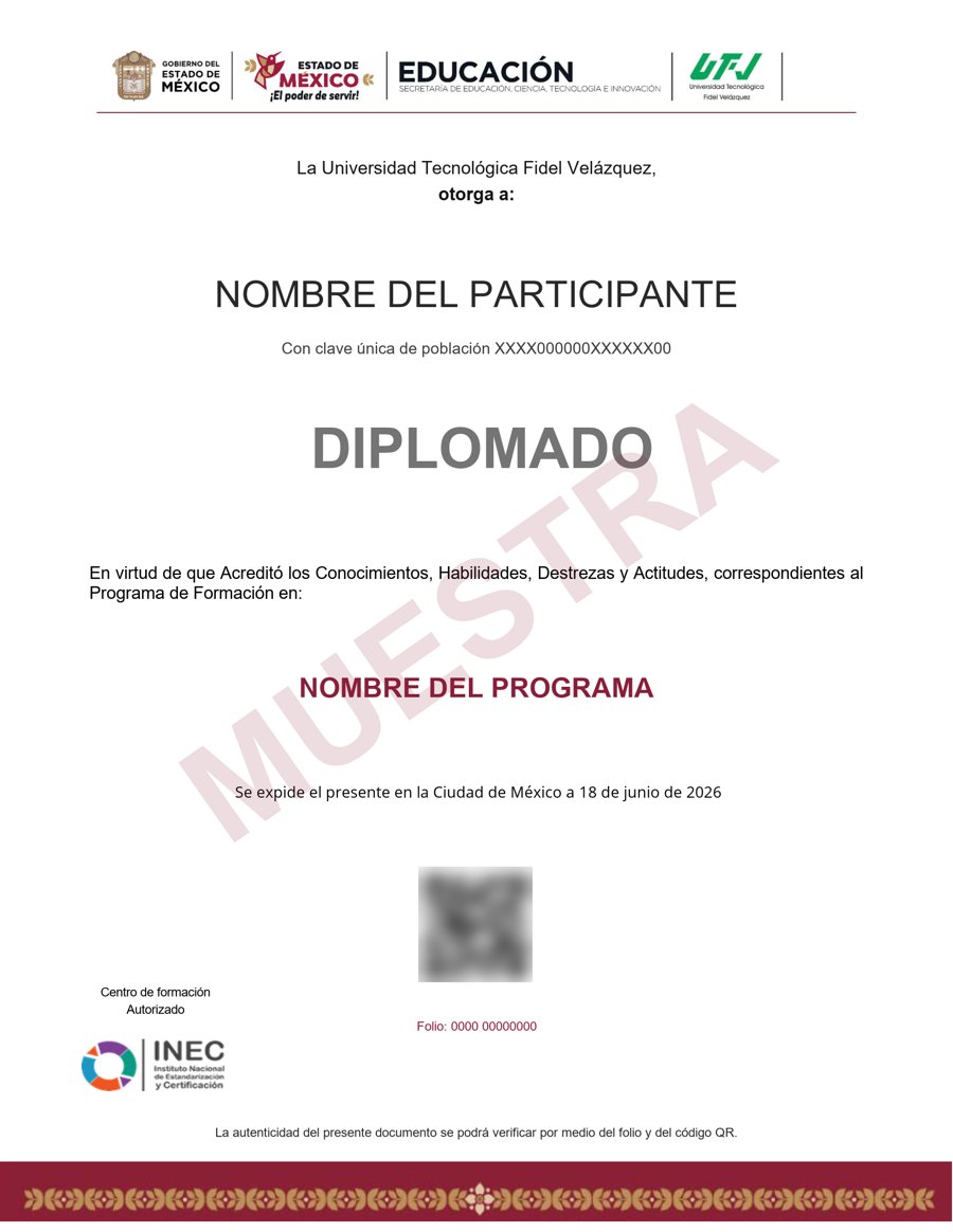
Muestra · verificable por folio y QR
- Emitido por la Secretaría de Educación Pública (SEP), a través del Gobierno del Estado de México. No es una constancia privada: es un documento oficial, y ese respaldo marca la diferencia frente a otras plataformas en línea.
- Contenido impartido por Liz Brown.
- Folio y QR verificables para compartirlo con quien te contrate.
Empieza hoy, a tu ritmo
Un solo pago y acceso inmediato al curso completo durante 12 meses.
- 10 unidades · 108 lecciones · 50 h
- 12 meses de acceso
- 5 cuestionarios de evaluación
- Certificado emitido por la SEP (Gob. del Estado de México) con folio verificable
Sobre tu inscripción
¿Cómo es el pago?
Un solo pago de $2,800 MXN. No hay mensualidades ni cargos recurrentes.
¿Cuánto tiempo tengo acceso?
12 meses desde tu inscripción, 24/7, para avanzar a tu ritmo.
¿Quién imparte el contenido?
El curso es impartido por Liz Brown; INEC gestiona tu inscripción, evaluación y certificado.
¿Qué pasa cuando vence mi acceso?
Puedes renovar tu cuenta tú mismo desde la plataforma, sin trámites ni esperas.

